When we see a simple yellow rectangle, we immediately associate it with National Geographic. When we see the golden arches, we know it’s a McDonald’s without even reading the name because the logo is an identity of an organization.
The designer of the National Geographic logo, Sagi Haviv, is also the designer for the NBC logo, the Mobil logo, and Animal Planet. Here is what he says about logos:
“A logo is not communication. It’s identification. It’s the period at the end of the sentence. Not the sentence itself.”
So, even though the logo does not aim to communicate, since it is an identification of the brand, it does have some hidden symbols.
The Secret of the Car Emblem with Wings
The Bentley car emblem also has some hidden secrets that make depict what the brand values, what it stands for, and how it works.
Here are the 5 hidden secrets in the Bentley logo:
1. Why wings?
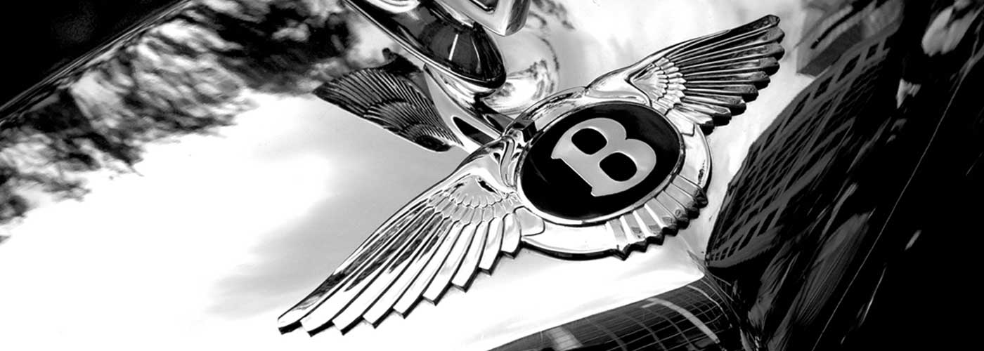
The Bentley logo has a B in a circle, a pair of wings, and a tail. The logo looks like a bird, and the purpose of the wings was to symbolize flight.

The reason is that before going into car manufacturing, Bentley was involved in making aircraft engines in the First World War, thus the wings on the logo. It also symbolizes that it is “celestial” or out worldly.
2. Number of feathers on each wing changes
The number of features of the wings has changed for each model and is asymmetrical. Here’s a history of the number of wings on the Bentley symbol:
- The old Bentley symbol in vintage cars had 14 feathers on one side and 13 on the other.
- Derby cars from Bentley had 10 and 11 feathers in the logo.
- In the 1930s, when it was under the ownership of Rolls Royce, the asymmetrical feathers changed to 10 on each side. In terms of racing cars, this is supposed to bring good luck.
The asymmetry of the wings was returned in the 1990s, restoring the uniqueness of the logo.
So, the change of the number of feathers and whether they are asymmetrical is an interesting thing to note across the different car categories and models that Bentley offers.
3. The Complexity of the Logo Symbolizes Something
Many car symbols like Toyota, Mitsubishi, or Mercedes are simple. Many brands believe the simpler the logo, the more recognizable it is. However, that is not the case with Bentley. The complexity of the logo symbolizes the creativity and artistic nature that the company stands for.
In the olden days, some cars also had a 3D model. It was a flying B which looked quite exquisite. Since Bentley was in the luxury car business, the car’s gold or silver 3D logo personified class and exquisiteness.
4. The font has not changed in a century
An interesting thing to note is that the font of the B etched in between the wings has not changed. It is in Serif font and hasn’t changed in more than 100 years. This symbolizes the company’s respect for its culture and its traditions.
5. The Flying B
The flying B was first an automotive accessory in the 1920s and 1930s. It was discontinued for a while before making a comeback in the 1970s.

To mark the celebration of the 100th year of Bentley in 2019, a competition was held to redesign the flying B. Bentley added the winning design of the competition to the new Flying Spur, which was a class apart from the other luxury cars.
Final Words
Bentley is a symbol of exquisiteness and luxury. However, the logo of Bentley has some hidden secrets that show the company’s rich history and how it has evolved over the century. We hope you enjoyed these secrets.
If you want to rent Bentley or want to know more about its features, get in touch now!


